Exploring Equitable Planning Solutions Through Mapping
Mapping to Show the Impact of Planning Decisions
Maps can transcend language and culture to promote understanding among diverse groups of planning policy stakeholders. The explanatory power and universality of maps make them a powerful tool for showing the influence of planning policies in different communities over time.
In particular, maps can demonstrate the impact of place-based policies and practices as a driver of neighborhood conditions and access to opportunities. Visually representing the impact of policies past and present can help us better grasp the causal pathways between policy actions and results.
Planners and policymakers in the past did not always make decisions with fairness and equity in mind. Many place-based planning and policy decisions aggravated existing inequities and injustices, excluding generations of people from opportunities to live healthy, prosperous lives.
City and regional planning is a technocratic field that produces long-range plans to guide the future growth and development of communities. The implementation of long-range plans — which takes place through a complicated array of local policies and actions — can often feel opaque to people who aren’t steeped in the nuances of planning practice and policymaking.
Maps that connect past place-based policies with current-day conditions in those places paint a picture that can help audiences understand the unintended consequences of long-range plans and policies. A map of historical policies and land uses coupled with a map of present-day health outcomes can provide insight into how much progress has been made in addressing inequities created by past planning decisions.
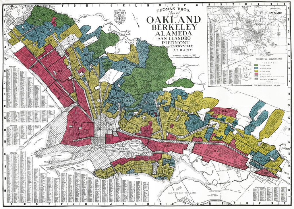
Racist Redlining Then, Inequities Now
Starting in the 1930s, the practice of redlining legalized racially discriminatory lending and investment practices throughout the United States. Redlining is one of the most notoriously racist place-based practices that catalyzed racial and social inequities.
The color-coded and graded residential security maps developed by the Home Owners' Loan Corporation and adopted by the Federal Housing Administration designated predominantly Black and brown neighborhoods as “hazardous” for investments and shaded them red on their maps (i.e., redlined them). At the same time, those policymakers deemed white neighborhoods “best” or “still desirable” and shaded them green or blue (i.e., greenlined or bluelined them).
Redlining contributed to the geospatial isolation of and disinvestment in BIPOC communities.
This intentionally racist grading system for neighborhoods resulted in discriminatory denials of business and home loans for people of color and contributed to geospatial isolation of and disinvestment in BIPOC communities. Although the practice of redlining was made illegal by the Fair Housing Act of 1968, the ramifications of these past decisions are still affecting these neighborhoods in the present.
Today, planners and other policymakers are still working to understand and counteract the impacts of redlining not only in terms of unfair economic consequences but also in terms of inequitable health outcomes.
A Tale of Two Oaklands
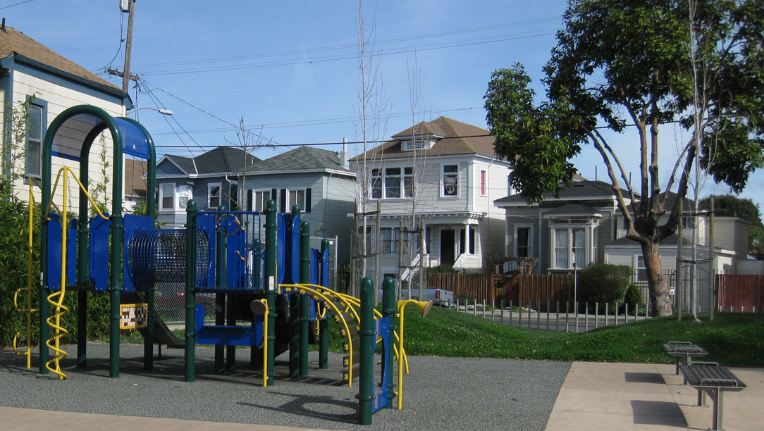
Like many US cities, Oakland, California — where ChangeLab Solutions is based — is still grappling with the effects of redlining in the present day.
Back in 2008, the Alameda County Public Health Department published a report documenting that someone born in West Oakland — a predominantly Black neighborhood not far from ChangeLab Solutions’ office — can expect to die almost 15 years earlier than a person born in an Oakland hills neighborhood less than three miles away. More recent data from 2015 suggest that racial health inequities continue to increase for Black, Indigenous, and Latinx residents of Oakland.
These health inequities did not arise by random chance: it is no coincidence that West Oakland in the 1930s was completely redlined and neighborhoods in the Oakland hills were greenlined and bluelined. But what do these past decisions mean for Oakland as it moves forward? How can we track patterns of disinvestment and investment through time? And why do these kinds of efforts matter?
While maps cannot draw direct causal links between discriminatory policies and community outcomes, they can show trends. For example, maps can show that communities that were denied access to supportive resources and opportunities — including access to quality schools, grocery stores, and financial capital for home ownership — experience higher rates of premature death and chronic diseases like asthma and diabetes. Unsurprisingly, West Oakland fits all of these trends, due in large part to its history as a redlined community.
Similarly, maps can show how neighborhoods with greater access to opportunities, needed resources, and green spaces and less exposure to environmental pollution tend to have better health outcomes, such as longer life expectancy. Previously greenlined and bluelined neighborhoods in the Oakland hills benefited greatly from these types of structural and environmental advantages.
Unless formerly redlined cities like Oakland enact carefully considered policy changes to counteract the harmful legacy of racist planning practices, it is highly likely that measurable inequities in wealth, health, and opportunity associated with redlining will persist for future generations.
Addressing the Drivers of Inequity
ChangeLab Solutions has identified five fundamental drivers of health inequity: (1) structural discrimination, (2) income inequality and poverty, (3) disparities in opportunity, (4) disparities in political power, and (5) governance that limits meaningful participation.
Most laws and policies — including discriminatory policies like redlining — intersect with all five of these drivers of inequity in one way or another. Redlining is a clear example of a policy that encompasses all five drivers of inequity. However, because redlining derives from specific policy decisions made by government agencies and powerful businesses, it is primarily symptomatic of the first fundamental driver: structural discrimination. Solutions aimed at mitigating the inequitable consequences of redlining should take into account the needs and perspectives of the communities that have been most harmed.
How, then, can policymakers engage with historically excluded communities to inform proposed planning policy changes? ChangeLab Solutions’ answer is our suite of resources for planners and other decision makers who participate in the planning process.
Solutions aimed at mitigating the inequitable consequences of redlining should take into account the needs of the communities that have been most harmed.
Our recent publication The Planner’s Playbook equips planners and policymakers with tools and step-by-step instructions for centering equity in every phase of the planning process. The playbook emphasizes the need for substantive, equity-informed community engagement efforts throughout the development of plans, with special attention to incorporating input from community groups that have been excluded from public policymaking in the past.
The injustices and harms of redlining and other discriminatory place-based policies must not be ignored or forgotten. With the right tools — and the right people at the table — communities across the United States can begin the crucial work of creating a healthier built environment that serves all community members.
The Planner’s Playbook is a practical guide that offers concrete steps, resources, and examples to help planners engage community members and center equity at every stage of their planning practice.
By Jessie Wesley, Tina Yuen, Jessica Nguyen & Patrick Glass
Photographs by Dan Brekke, ChangeLab Solutions
12/6/2021
Photographs by Dan Brekke, "West Oakland Bart," CC BY-NC 2.0 DEED, via Flickr